User interface fail - in a research building
Went to a seminar at UCI on advanced user interfaces, in a new/fancy building paid for by a local billionaire.
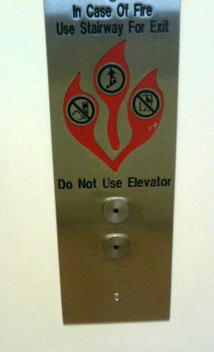
This is what i see - in the building used for seminars - when I go to UCI, usually for a talk related the user interface design. This panel to call the elevator is in the Donald Bren building. To find the elevator in the first place is a bit of adventure. You walk in the front door, through a side door, and then around a couple corners - all unlabeled.
This panel is the user interface to call the elevator. The most used element is the button to call the elevator - and there is absolutely no clue as to function. The unlabelled least obvious button at the bottom panel is the button to call the elevator. (No idea what the other button does.)
This in a building that hosts talks on advanced user interface design. The level of irony is truly sublime.
I particularly like the words "Do not use elevator" directly above the buttons. The button-like emblems above are a nice touch.
The control panel inside the elevator is equally impressive.
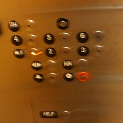
The building only has six floors, so the simplest, most obvious user interface design would be a vertical column of six buttons, numbered top to bottom from six to one. If you scan the buttons in left-to-right and top-to-bottom reading order, you get 4-5-6-1-2-3. Apparently the button you are most likely to want to use is "PH".
Not the most obvious arrangement.
I guess when a billionaire gives you a new building, you don't complain about the screwy design. Then again, maybe the software folk at UCI got to design the building?